SyFI Trace Atlas
Trace assistant
Reading the public SYFI pool
357,161 agent steps across Claude & Codex — public, shareable.
Answers run real DuckDB/Python in a sandbox · code is shown
All figures
Session
one continuous trace of work, often spanning multiple requests or problems.
Request
one user input through the agent's final response.
Agent step
one model call inside a request.
User-initiated step
an agent step started by user input.
Tool-triggered step
an agent step started by a tool result.
Overview

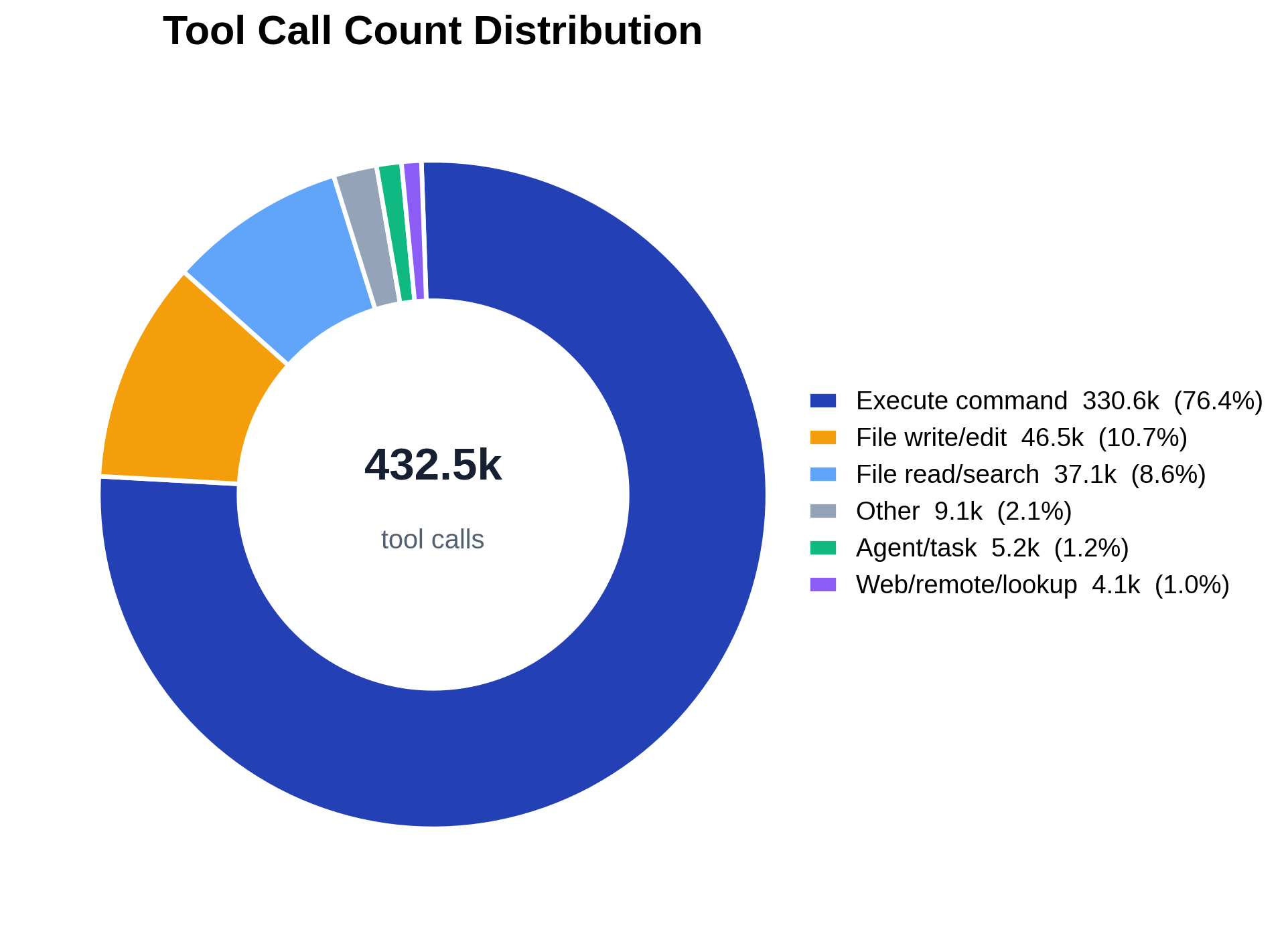
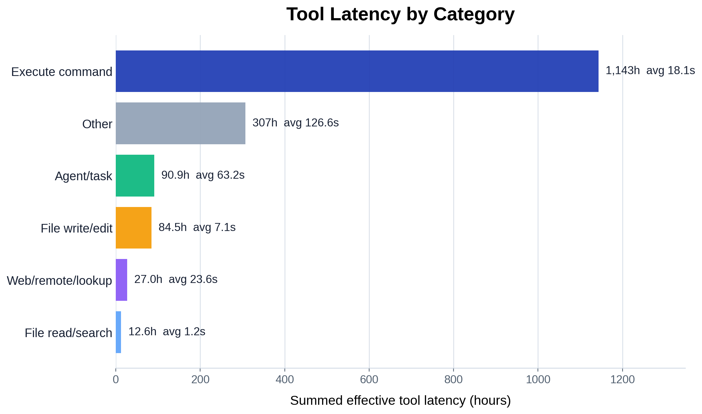
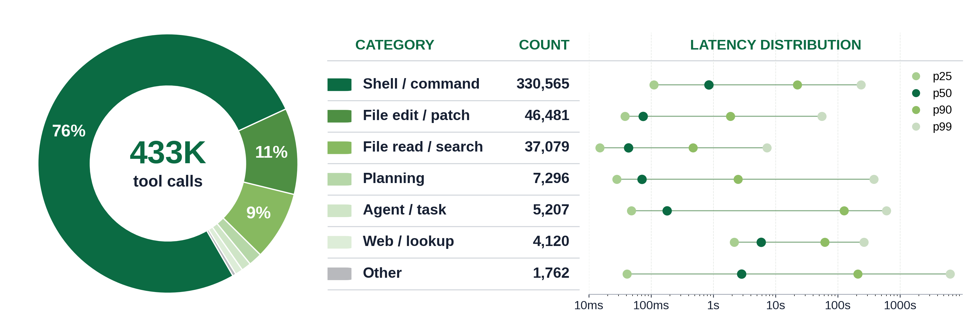
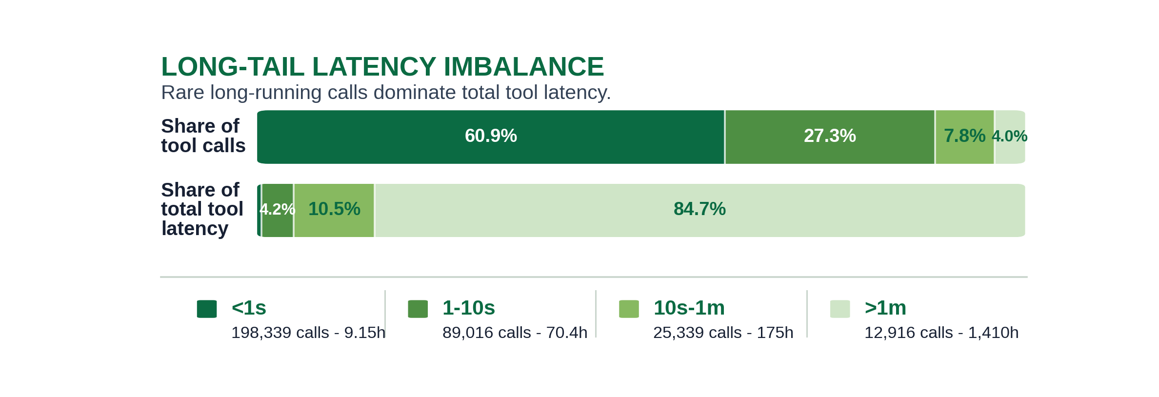
When tools are folded into a handful of coarse categories (execute, file write/edit, file read/search, agent/task, web/lookup, …), how are calls and latency distributed across those categories — and how concentrated is the latency long tail in a few slow calls?

Individual tool names are numerous and provider-specific; this experiment groups them into coarse categories that mean the same thing across Claude Code and Codex, then reports how calls and effective latency split across those categories.

Method and assumptions:

  • One row per call. We count entries in tool_calls (the UNNESTed tools[]), not agent steps.
  • Two fixed tool→category maps. A 5-category-plus-other map (Execute command, File write/edit, File read/search, Agent/task, Web/remote/lookup, Other) drives the count ring and latency bar; a 7-bucket presentation map (which additionally splits out Planning) drives the dashboard. Both maps are explicit name→category sets ported verbatim — the tool_category_tool_map.csv emits the realized (category, provider, tool) breakdown for auditing.
  • Effective tool latency = tool_internal_latency_ms if present, else tool_wall_latency_ms (the legacy latency_ms fallback is not in the normalized schema). Only positive latencies contribute to summed latency and to the percentile/long-tail views; missing and non-positive latencies are counted separately but excluded from the sums.
  • Long-tail bins. Positive latencies are bucketed into <1s, 1–10s, 10s–1m, >1m to contrast each bucket’s share of calls against its share of total latency.
Figures 4
Tool-call count share by coarse category.
Fig. 1Tool-call count share by coarse category.

The donut shows how the agents’ tool calls split across the six coarse categories. The ordering is heavy-headed: execute-command and file read/search/write dominate the count, while agent/task and web/remote/lookup are comparatively thin slices. The center label is the total call count and each slice is annotated with its percentage share; the legend carries exact counts and shares so the long tail (small slices) stays legible.

Summed effective latency by tool category.
Fig. 2Summed effective latency by tool category.

Re-ranking the same categories by summed effective latency (hours) instead of call count tells a different story: the category that consumes the most wall-time is not necessarily the most called one, because per-call cost varies widely (each bar is annotated with its average seconds per call). This is the count-vs-cost gap — cheap high-frequency primitives vs. expensive lower-frequency calls.

Tool category dashboard with call share and latency quantiles.
Fig. 3Tool category dashboard with call share and latency quantiles.

The presentation dashboard combines three views of the 7-bucket map: a call-count donut (left), a ranked category table (middle), and a log-scale latency-quantile strip (right, p25/p50/p90/p99 per category). The quantile strip exposes the within-category spread — a category can have a modest median yet a p99 orders of magnitude larger, which is exactly the long-tail behavior the next figure quantifies in aggregate.

Call share versus latency share across latency bins.
Fig. 4Call share versus latency share across latency bins.

This is the headline imbalance: the top bar is each latency bin’s share of calls, the bottom bar its share of total latency. The sub-second bin holds the large majority of calls but a small sliver of total latency, while the >1m bin is a rare fraction of calls yet dominates summed latency — i.e. a handful of slow calls account for most of the time spent in tools. Exact figures are in tool_latency_long_tail_imbalance.csv.

Reference

Code structure

analyze.py is a query→fold→plot pipeline over the shared trace DuckDB:

  • load_tool_aggregates(con) — one GROUP BY (provider, tool_name) over tool_calls ⋈ rounds that returns per-tool calls, error_calls, the valid/missing/non-positive latency-class counts, and summed positive latency. Provider/tool-name normalization (<unknown-provider> / <unknown-tool>) is done in SQL to match the old loader.
  • load_positive_latency_histogram(con)(tool_name, latency_ms, count) rows for positive latencies, expanded in Python into the per-category latency lists the percentiles consume.
  • scan_trace / scan_trace_presentation / scan_trace_long_tail_latency — fold the per-tool aggregates into the coarse categories using the verbatim category_for_tool / presentation_category_for_tool maps (summing is order-independent over the integer-ms latencies).
  • category_rows / presentation_rows / long_tail_rows + their write_*_csv — shape and emit the four CSVs.
  • plot_count_ring / plot_latency_bar / plot_dashboard / plot_long_tail_imbalance — the four figures. main() wires the standard trace_db CLI and embeds the PNG sidecar.

The data layer (parsing, surrogate keys, schema) lives in artifacts/utils/trace_db.py; see artifacts/utils/DB_SCHEMA.md.

Running it

# default merged trace, output next to this README
uv run python artifacts/tool_calls/tool_category_distribution/analyze.py

# a specific trace (materialized to a temp DuckDB cache on first use)
uv run python artifacts/tool_calls/tool_category_distribution/analyze.py -i trace/sample.jsonl

# a prebuilt DB (run_all.py's build-db step passes this), into a chosen dir
uv run python artifacts/tool_calls/tool_category_distribution/analyze.py --db /tmp/trace.duckdb -o /tmp/out

Outputs (written to -o, default this folder)

  • tool_category_count_ring.png — donut of call counts across the 6 coarse categories.
  • tool_category_latency_bar.png — summed effective latency (hours) per category, with average.
  • tool_category_dashboard.png — combined donut + category table + latency-quantile strip for the 7-bucket presentation map.
  • tool_latency_long_tail_imbalance.png — call-share vs latency-share across the <1s … >1m bins.
  • tool_category_summary.csv — per coarse category: calls, share, error rate, latency-class counts, summed/avg latency.
  • tool_category_tool_map.csv — the realized (category, provider, tool_name) breakdown.
  • tool_category_dashboard_summary.csv — per presentation category: calls, share, p25/p50/p90/p99 seconds.
  • tool_latency_long_tail_imbalance.csv — per latency bin: calls, call share, latency, latency share.
  • result_analysis.md — generated run log.

The PNGs are self-contained — each embeds this README, the CSVs, and the plotting code. Unpack with python artifacts/utils/png_sidecar.py extract <png>.

SyFI Trace Atlas · experiment detail